BloomHaus is a modern floral retail boutique that blends contemporary floral design with curated home décor and artisanal gifts. Positioned as a luxurious, minimal lifestyle destination, the brand serves women who value beauty, intentional living, and refined self-expression. This branding identity explores a cohesive visual system through color, typography, logo development, packaging, and real-world applications, with the goal of creating an organic, inviting, and elevated brand experience that brings mindful, thoughtful design into everyday life.
Project Type
Floral Retail Brand Identity
Purpose of Project
Brand identity development for a modern floral retail boutique.
Date
December 2025
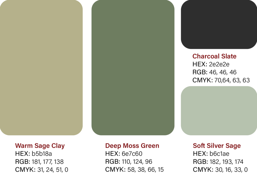
Brand Color System
This color palette is inspired by natural, calming environments, combining warm earth tones with soft botanical hues. Warm Sage Clay and Deep Moss Green create an organic, grounded foundation, while Soft Silver Sage adds a light, airy balance. The inclusion of Charcoal Slate introduces structure and contrast, giving the system clarity and modern refinement.
Typography
This brand uses AD Gothic for its bold, modern presence in titles and headings, giving layouts a strong, contemporary voice. Paired with Minion Variable Concept for body copy, the typography system brings warmth, elegance, and readability to longer text. Together, the two typefaces create a balanced visual hierarchy that feels both refined and approachable.
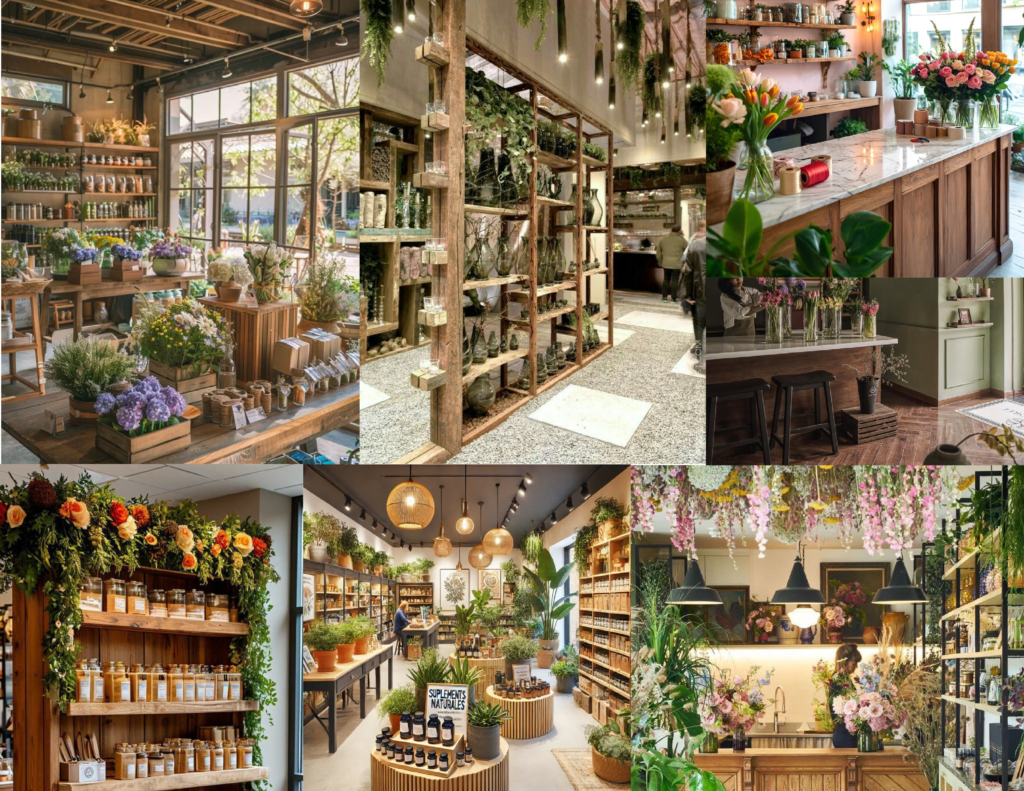
Moodboard
This moodboard establishes the visual tone for BloomHaus, inspired by modern floral shops with warm wood textures, soft lighting, and abundant greenery. It reflects a balance of natural elegance and approachable sophistication, guiding the brand toward a fresh, inviting, and thoughtfully curated aesthetic.
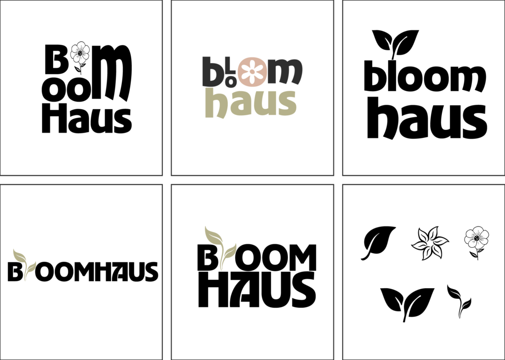
Early Versions
These initial sketches capture the early exploration phase of the BloomHaus brand identity, where I experimented with typography, icon concepts, and layout structures to define the visual direction.
Early Versions
The branding process for BloomHaus began with a wide exploration of digital sketches, experimenting with typography, floral motifs, and leaf forms to capture the brand’s organic, modern personality.
Early Versions
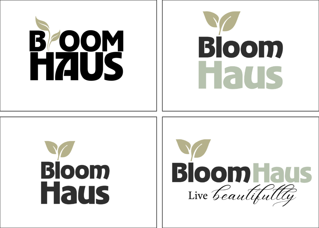
At this stage, I narrowed the identity down to two strong logo directions and began incorporating a tagline. I explored soft green hues to emphasize BloomHaus’s natural, calming aesthetic.
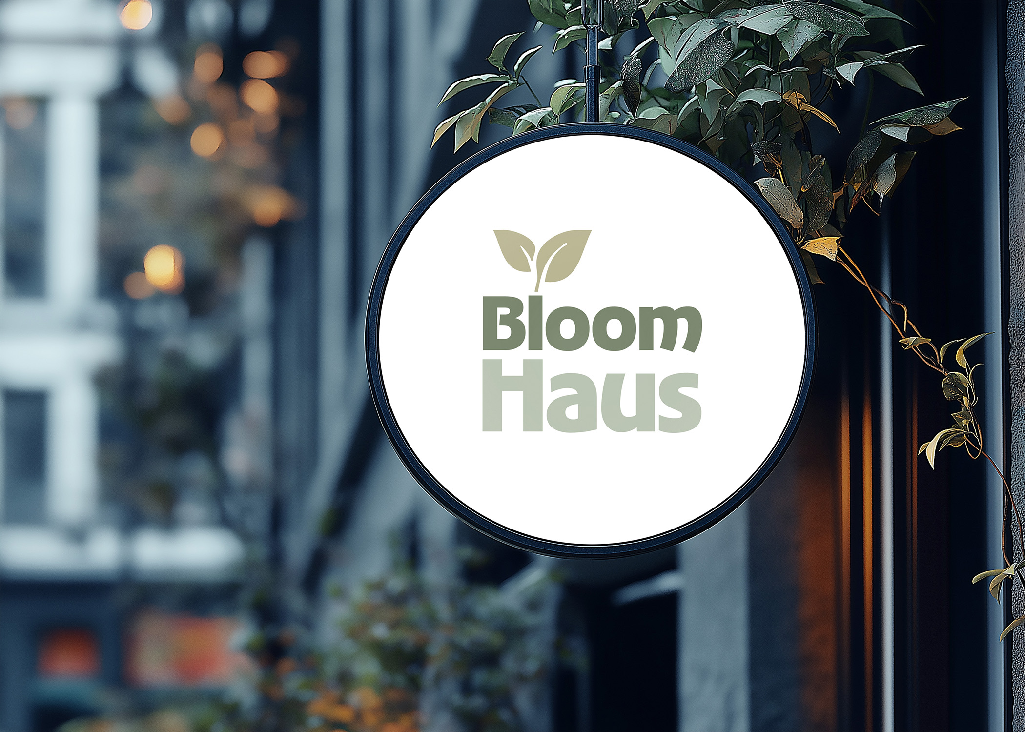
Final Deliverables
In the final design, I transformed the ‘L’ in Bloom into a subtle vase, visually grounding the plant element and reinforcing the brand’s floral retail concept. Paired with a monochromatic green palette, the identity evokes freshness, harmony, and the natural elegance at the heart of BloomHaus.
Intent
These final applications bring the BloomHaus brand to life, showing how the visual system translates into thoughtful, polished materials. Each piece is designed to feel calm, organic, and elevated, echoing the brand’s commitment to simple living and natural beauty. Collectively, they form a unified identity that feels both inviting and memorable.