Balance Yoga Guidelines &
Web Banner
Balance Yoga Studio is a modern wellness space that offers restorative and flow-based classes designed to help students reconnect through breath, mindful movement, and inner balance. This brand guidelines and web banner campaign establishes a calm, elegant visual identity for the studio through cohesive typography, a refined color palette, and minimalist layouts that highlight serenity and renewal.
Project Type
Branding Guidelines & Web Banners
Purpose of Project
Develop a cohesive brand system for web and digital use, including web banners designed for paid advertising and online promotion.
Date
December 2025
Color Palette
This color palette blends deep, grounding tones with soft, restorative accents to reflect the balance and calm at the heart of the brand. Midnight Flow and Mulberry Root provide a strong, elegant foundation, while Sage Balance, Misty Clarity, Rose Clay, and Smoke Stillness introduce gentle, natural hues that evoke harmony, mindfulness, and emotional warmth. Together, the colors create a serene yet sophisticated identity perfect for a modern wellness experience.
Typography
The typography system combines the refined structure of Reiher Headline with the soft, expressive character of Valeyola, creating a balanced visual voice that mirrors the brand’s calm and intentional energy. Reiher Headline provides clarity and elegance for headlines, titles, and body copy, ensuring readability and consistency. Valeyola serves as a graceful accent for quotes and taglines, adding a touch of personality and warmth without overwhelming the design.
Sketches
In this stage, I explored different visual interpretations of the word Balance, experimenting with symmetry, flow, and symbolic elements like leaves, yoga poses, and minimalist line work. These sketches allowed me to test how the brand’s essence, harmony, calm, and centeredness that could be expressed through simple shapes and typography.
Submark Digital Sketches
In this phase, I translated the strongest concepts into clean digital sketches to explore how each symbol could represent the company’s identity. By refining forms like the lotus, meditation figure, balance symbol, and spiritual marks, I tested which visual direction best captured the brand’s core values of harmony, wellness, and mindful living. These sketches helped define the foundation for the final brand mark.
Final Logo Design
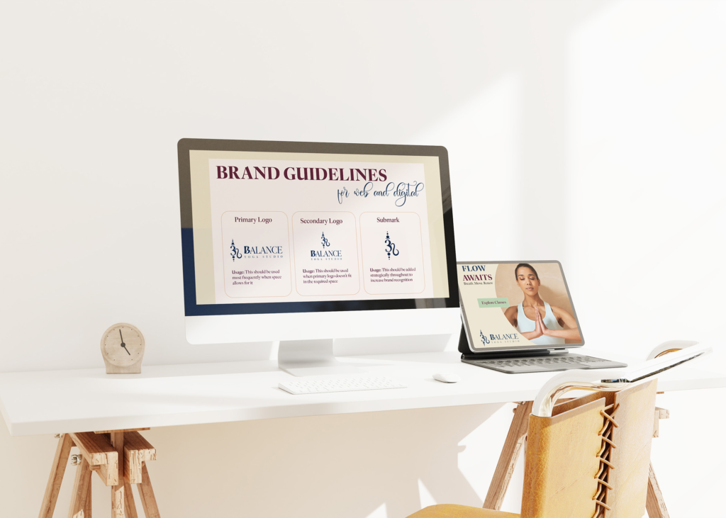
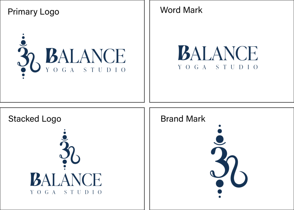
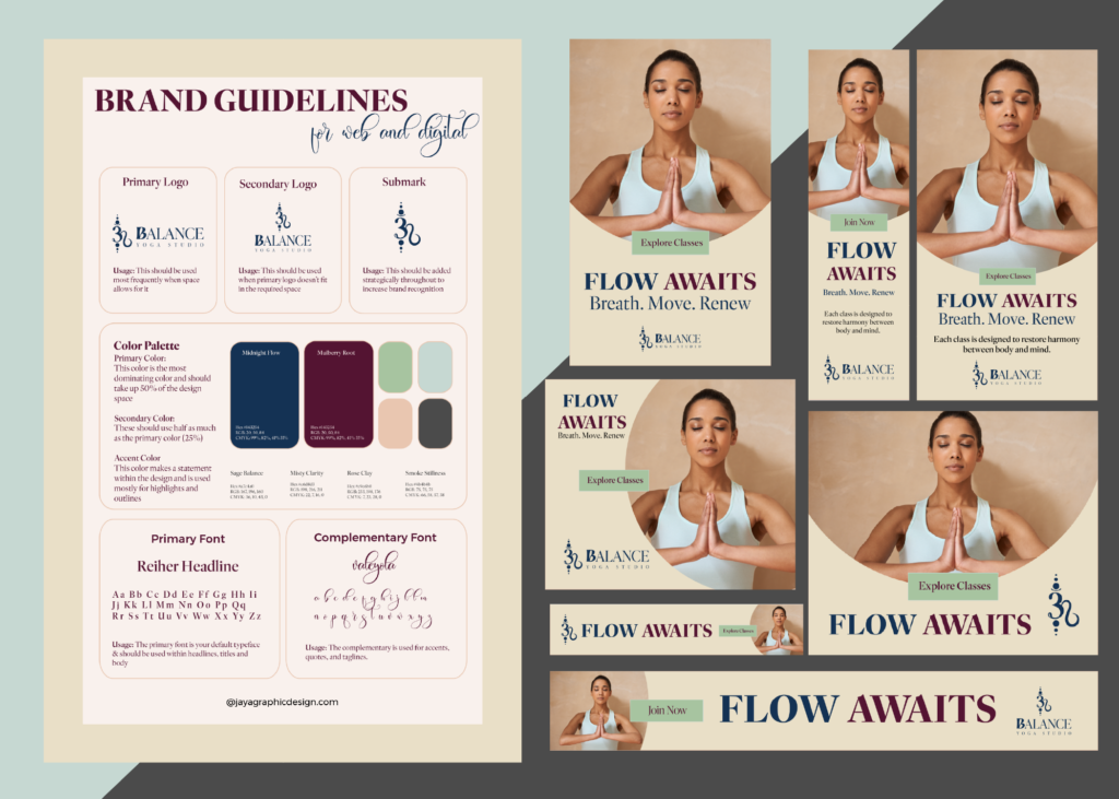
The final identity system brings together a refined balance of symbolism, typography, and harmony. The primary logo pairs an elegant brand mark with a strong, modern serif wordmark to communicate professionalism and calm. The stacked and horizontal variations ensure flexibility across print, digital, and environmental applications, while the standalone brand mark offers a recognizable icon that captures the studio’s essence.
Final Design
The final Balance Yoga branding guidelines and web banner campaign present a calm, refined visual identity rooted in harmony and mindfulness. Soft neutral tones, deep accent colors, and elegant typography work together to communicate a sense of clarity and renewal. The web banners use consistent layout, serene imagery, and purposeful hierarchy to highlight class offerings while reinforcing brand recognition across digital platforms. The overall system feels cohesive, modern, and restorative, perfectly capturing the essence of Balance Yoga’s mission to help students breathe, move, and renew.
Intent
The completion of this project demonstrates how a cohesive digital brand system can support Balance Yoga Studio’s growth through clear visual communication and elevated online presence. By unifying branding guidelines with a full web banner campaign, the identity extends seamlessly across digital platforms, enhancing recognition, promoting class enrollment, and reinforcing the studio’s mission of mindful movement and modern wellness. This final outcome reflects a refined, intentional design approach that is adaptable for future marketing and scalable as the studio expands.
Environmental Contact